fitness
How can I display a statistic to analyze my performance over time?
06/01/13 11:36 Filed in: Diary
Problem: After using TrailRunner for a while you want to see how your performance has improved. You therefore would like to see a chart displaying your average milage, speed or fitness per over time.
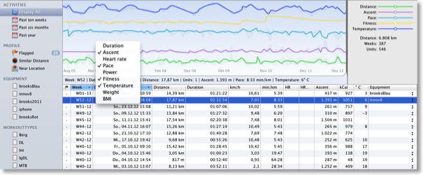
Solution: In the diary, select the weeks tab. You see a chart that displays values over time.
- Right click the chart to hide/show rows like duration, distance, speed, etc.
- Select a range within the chart to analyze values within the selected period of time
- Select one or more entries within the bottom table of activities to see where they are located in the chart.
Tip: To build classes of workouts that you can compare to each other, categorize your workouts by:
- creating separate diaries for each type of activity (like biking and running).
- using tags for equipment or workout-type.
More: TrailRunner Help > Diary
What is "My Best Performance"
22/04/12 10:53 Filed in: Conceptual
Problem: The diary displays My Best Performance. But that was not my fastest performance. What is it then?
Explanation: My Best Performance is based on the fitness value you achieved. The theory behind that is your most economic run — not necessarily your fastest.
On Fitness: In TrailRunner, the fitness is a calculated value based on the average pace and heart rate of a workout. The idea is that if you where very fast with a low heart rate you are fitter, while the opposite applies if you where very slow and had a high heart rate. This value is just for orientation and does not have the accuracy of the methods used in Polar watches or other biometric methods, but it gives a pretty good overall impression. To compare your fitness values to average adults, take a look into this table.