split
How can I see the average pace/heartrate/speed for only a part of my workout?
22/04/12 10:50 Filed in: Help
Problem: When you import a workout as an activity in the diary, TrailRunner displays average and maximum values for speed, heart-rate for the whole workout, but how can you see these values for fixed split intervals or even a selected range like an uphill part only?
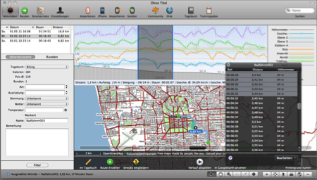 Solution: Within the graph, select a range to view the average/maximum values within that range. To get a more precise selection, e.g. to select km 1 to 2 or minute 60 to 90, open the black info panel that is available next to the lower window tools and directly select value ranges using a single-click to select the first value and shift-click to select the end of the selection range.
Modify workout courses
04/01/13 22:43 Filed in: Import
Problem: You forgot to turn off your GPS device or the signal was very weak at the beginning of your workout. You would like to trim your recorded workout data at the beginning and/or end.
Background: You can only modify workout courses for activities while you are about to import them. Once they are within the diary, it's not possible anymore to alter them.
Solution: Use the track-point inspector panel to modify the activities track before you import the activity.
There are two techniques you can now use to correct the data to be imported before you actually import them. In both cases, first open the track-point inspector panel in the bottom toolbar:
1) Select the range you want to remove. In the track-point inspector panel select the 'trim selection' command. This will remove all data points from the selection up to the nearest edge.
2) Select one data point, e.g. the first datapoint of the presumable next workout. In the track-point inspector panel, select the 'split at selection' command. This will remove the selected data point and create two new entries for either side of the selection.
Reference: Please also see Tutorial > Import Activities
Activity workout splits and caclulated aggregates
19/03/10 12:21 Filed in: Conceptual
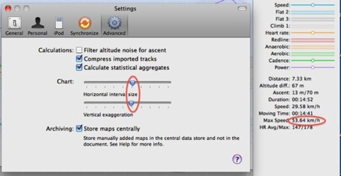
Problem: When you drag the slider in the horizontal interval settings, the value for maximum speed changes. Why is that so?
Explanation: TrailRunner can display the maximum speed value from either the imported workout data (if available) or can calculate the value by an analysis of your workout data.
On statistical aggregates
If your GPS Device has lost its signal and re-catches it, the recoded course may contain errors. This error may lead to unrealistic values as such signal jumps may assume you where moving faster that light. Therefore TrailRunner uses a low-pass filter of roughly 90% and takes the highest value within the result as your maximum speed. To turn this off, uncheck the calculate statistical aggregates option.
On split intervals
The horizontal interval size slider controls the size of interval splits.
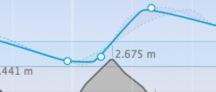
The intervals are being displayed as white lines in the graph, each containing a white circle on the value that was most common within this interval.
In addition the lowest values and the highest values within this interval are being displayed as a dot bordered gray region.
The overall maximum speed of an activity is the maximum speed from all these split intervals.
As this is a statistical calculation, the values may vary when you change the size of the split intervals. The bigger the intervals, any filtering becomes stronger.
Explanation: TrailRunner can display the maximum speed value from either the imported workout data (if available) or can calculate the value by an analysis of your workout data.
On statistical aggregates
If your GPS Device has lost its signal and re-catches it, the recoded course may contain errors. This error may lead to unrealistic values as such signal jumps may assume you where moving faster that light. Therefore TrailRunner uses a low-pass filter of roughly 90% and takes the highest value within the result as your maximum speed. To turn this off, uncheck the calculate statistical aggregates option.
On split intervals
The horizontal interval size slider controls the size of interval splits.
The intervals are being displayed as white lines in the graph, each containing a white circle on the value that was most common within this interval.
In addition the lowest values and the highest values within this interval are being displayed as a dot bordered gray region.
The overall maximum speed of an activity is the maximum speed from all these split intervals.
As this is a statistical calculation, the values may vary when you change the size of the split intervals. The bigger the intervals, any filtering becomes stronger.
What's the resolution of the workout data graph?
27/04/09 22:39 Filed in: Import
Problem: When I view my workout data in other applications like garmin training center, the data points for heart-rate and speed are much more noisy detailed than in TrailRunner. Additionally the TrailRunner graph seems not to start at the left edge of the chart but appears to be indented. Furthermore a TrailRunner graph line sometimes is being drawn as a straight line without any intermediate data points, although there should be some.
Background: Other applications display the raw data of a device. This makes the graph unreadable. The philosophy of TrailRunner instead is to display the overall trend and development of your workout session.
Approach: TrailRunner has an auto split feature where the workout is being sliced into fixed distance intervals. For each interval the statistical median value is being calculated and one data point reflecting this value is then being used as a representative. As the location of the representative can be somewhere in-between the first interval, the graph might appear to be indented. Furthermore if representatives in adjacent intervals fall onto a straight line, only the edges representatives are being drawn and the connection line depicts the trend development.
Details: The auto split feature uses the following distance intervals. By the time of this writing it’s 250 m for workouts shorter than 10 km, then 500m up to 20 km, 1000 m up to 50 km and 10000 m from there on. A route with 42 km would then have 5 intervals.
Example: Below the identical workout in Garmin Training Center (upper image) and TrailRunner (lower image)
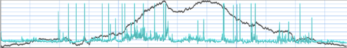
It’s rather obvious that the speed Graph in Garmin Training Center is full of noise and false signals. TrailRunner filters this out and gives you the statistical trend (blue line) for each interval (white circle within each interval separated by a white vertical line)
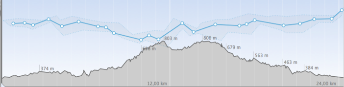
The thinner line around the blue line depicts the value range, so you still can make up that within the interval there was a great spread of values, but most of the time you stayed near the value depicted by the thick line.
BTW please note that the Garmin speed graph is upside down, so slower is a value near the top and faster is a value near the end. TrailRunner uses a the natural, mirrored display approach, where “better” is on top.
Background: Other applications display the raw data of a device. This makes the graph unreadable. The philosophy of TrailRunner instead is to display the overall trend and development of your workout session.
Approach: TrailRunner has an auto split feature where the workout is being sliced into fixed distance intervals. For each interval the statistical median value is being calculated and one data point reflecting this value is then being used as a representative. As the location of the representative can be somewhere in-between the first interval, the graph might appear to be indented. Furthermore if representatives in adjacent intervals fall onto a straight line, only the edges representatives are being drawn and the connection line depicts the trend development.
Details: The auto split feature uses the following distance intervals. By the time of this writing it’s 250 m for workouts shorter than 10 km, then 500m up to 20 km, 1000 m up to 50 km and 10000 m from there on. A route with 42 km would then have 5 intervals.
Example: Below the identical workout in Garmin Training Center (upper image) and TrailRunner (lower image)
It’s rather obvious that the speed Graph in Garmin Training Center is full of noise and false signals. TrailRunner filters this out and gives you the statistical trend (blue line) for each interval (white circle within each interval separated by a white vertical line)
The thinner line around the blue line depicts the value range, so you still can make up that within the interval there was a great spread of values, but most of the time you stayed near the value depicted by the thick line.
BTW please note that the Garmin speed graph is upside down, so slower is a value near the top and faster is a value near the end. TrailRunner uses a the natural, mirrored display approach, where “better” is on top.