TrailRunner is cutting of graph edges
07/04/10 14:17 Filed in: Conceptual
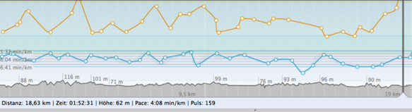
Problem: As depicted in the screenshot above, TrailRunner sometimes cuts off high values within a chart.
Background: To analyze a workout, the most interesting part of the chart is the area your workout did spend the most time in. If your GPS signal was weak and produced a noise peak, this single error would decrease the vertical resolution of your graph and therefore would make it unreadable. For this reason TrailRunner cuts off the chart for everything that is located outside of approximately 90% of your data points.
Customizing: To customize this behavior, you can control the display range under TrailRunner > Preferences > Advanced > Chart : Vertical exaggeration.
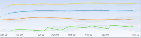
Problem: As depicted in the second screenshot above, the head or tail of a chart may not be displayed.
Background: The chart above displays a statistical trend. This means that TrailRunner takes all data points available, creates a set of intervals (in this case one month per each interval) and then displays a representative data point for this interval. The representative is the value that had the highest statistical appearance within the interval (mathematically this is called a median, not average). Then a data point is being displayed at the location of the representative. As this is almost never at the beginning or the end of the interval the graph seems to be cut off.
Sidenote: Please also note the gray border around the graph lines. The border depicts the maximum and the minimum values within each interval. So the graph gives you a good overall picture on the trend including extreme values. All data points are located within the gray area and the most frequent values are depicted by the colored line.